THANK YOU. wE’LL BE IN TOUCH.
Close
WE CREATE
POSITIVE INFLUENCE
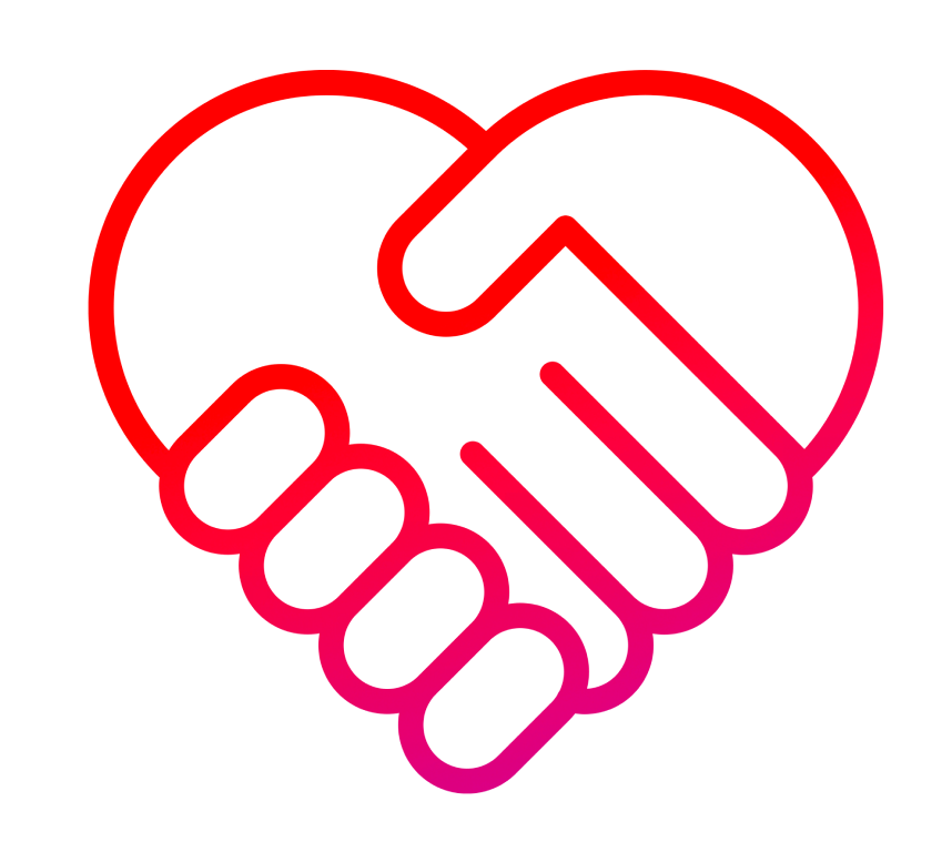
August United is a creator-led social media agency who unites influencers with brand actions that command attention, gain credibility and move communities to commerce.

Influencer marketing
As a top ten global influencer marketing agency, we are experts in designing audience-first and outcome-based influencer programs. By pairing relationships and trends with technology and data-informed decisions, we design and optimize campaigns from end-to-end.
Social Media Management
We create integrated social media strategies that humanize brands, increase discovery and engage communities. On the pulse of evolving platforms, we proactively respond in brand voice as experts at creating content for paid, earned and owned media with agility to scale.
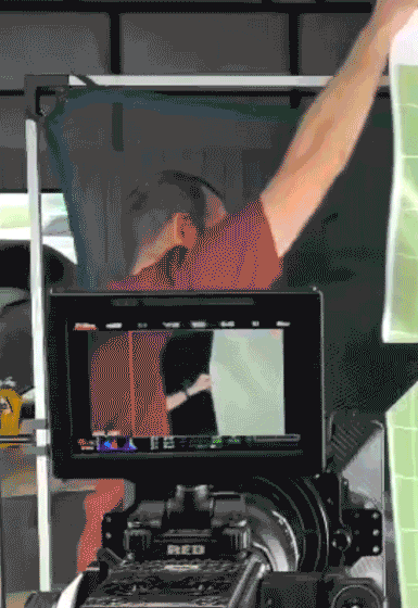
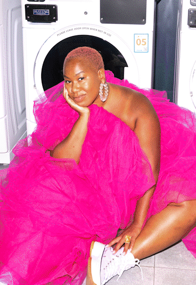
Content Creation
Whether we’re collaborating with external creators or producing internally, our content creation team is capable of shooting, editing, animating, and optimizing digital assets to perform on all social platforms.